US Treasury yield curve steepening is likely to gather pace in coming months
There’s no free lunch – this is part of the bill for 22 per cent M2 expansion in 8.5 months and a budget deficit worth 16 per cent of GDP
Deficit stimulus will continue, no matter who wins the Presidential Election
Inflation may have already been picking up prior to COVID-19, but was obscured by the disruption of the pandemic
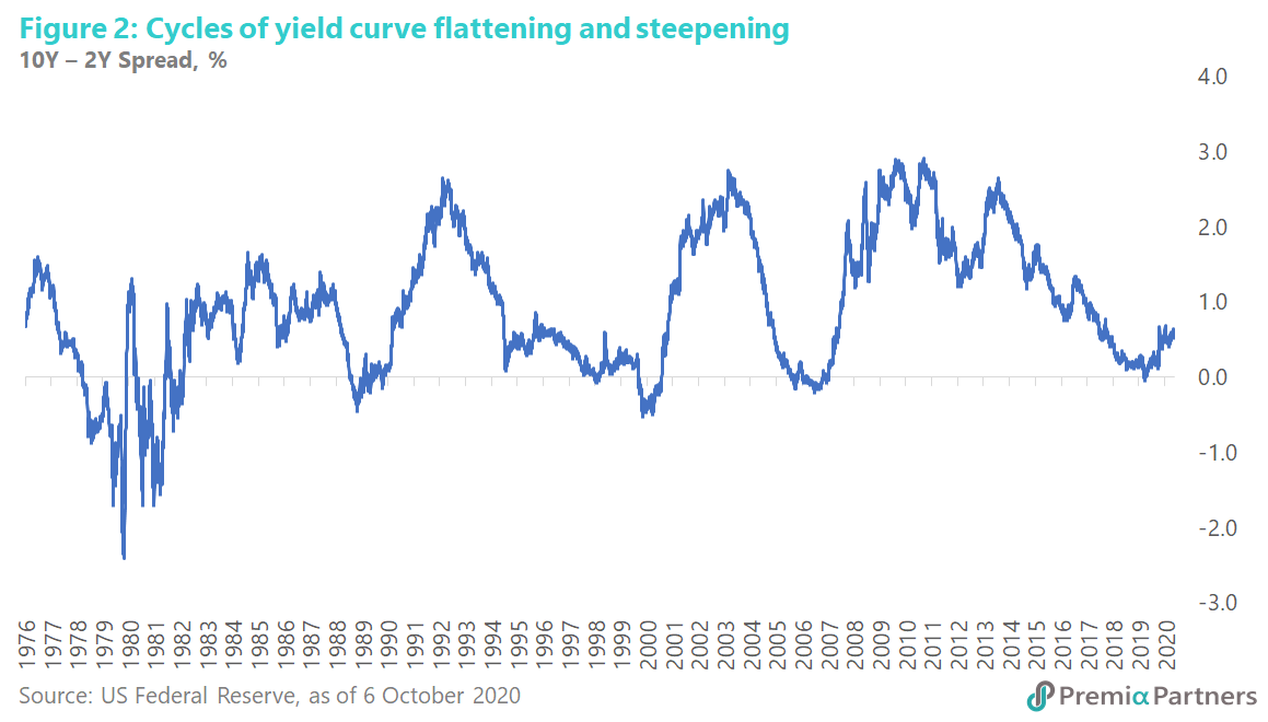
An almost 4-year cycle of curve flattening appears to have ended late last year – a long cycle of steepening may now lie ahead
10-year breakeven inflation is now at 1.7 per cent but the 10-year US Treasury yield is at only 0.74 per cent – this could well be a “train wreck” waiting to happen for bond investors
Yield curve steepening – which has been accelerating in recent weeks as the market contemplates a whopper of a stimulus package under a possible Biden White House – is likely to continue regardless of the winner on November 3.
Near-term drivers – the coming US fiscal explosion. Many explanations have been offered for the steepening of the US Treasury yield curve from August – accelerating again from late September (figure 1): 1) The size of the US pandemic stimulus, 2) the Federal Reserve’s new 2 per cent average inflation targeting, 3) the growing possibility of a Biden victory.
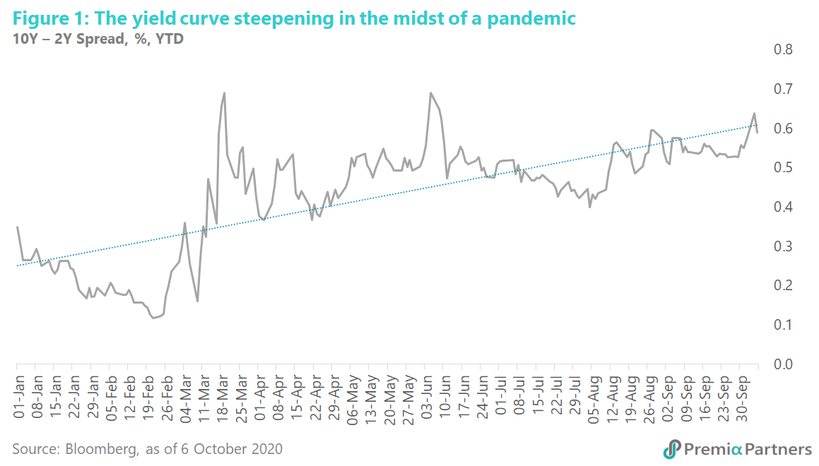
The common link for the above drivers of recent yield curve steepening is fear of an explosion of US fiscal deficits. Mind you, the budget deficit is already estimated by the US Congressional Budget Office at 16 per cent of GDP this year – the highest level since World War Two. Yes, spending on misery alleviation will likely fade after the pandemic, but after COVID-19 comes the spending on economic reconstruction.
All the above narratives are valid. However, there may be even bigger forces at work: secular forces of mean reversion. To be specific, there are powerful, multi-decade cycles at work here.
The turning point in yield curve steepening may have actually started in August 2019. Mean-reversion of the 10-year minus 2-year US Treasury yield spread appears to have started back in August 2019. Yet, the disaster and drama of the COVID-19 pandemic seem to have focused minds more on the immediate than the long-term. The consequent deep economic decline in the US and the Fed’s return to the “zero bound” may have made yield curve steepening seem improbable any time soon.
Looking at the long-term cycles of the 10-Year Treasury, Constant Maturity, Minus the 2-Year Treasury, Constant Maturity (T10Y2Y), in March 1989, the spread bottomed at -0.45 per cent. Again, it ended another down-cycle in April 2000 at -0.52%. The next bottom was late-2006 to early-2007 when the spread hit -0.15%. It is likely we hit another bottom in August of last year at -0.04% (figure 2). The mean reversion from there was interrupted by COVID-19 but not thrown off its trajectory.
The markets may have missed a gradual inflationary ascent – that is, until late last year when the yield curve started to steepen albeit tentatively. The long-term mean reversion in the yield curve can be simply boiled down to the consequences of the relentless fiscal and monetary stimulus of the US economy since the Global Financial Crisis/Great Recession of 2008-2009.
The Fed tripled down on quantitative easing through so-called QE1, QE2 and QE3, and now to an open-ended/unlimited pandemic bond-buying programme with no name.
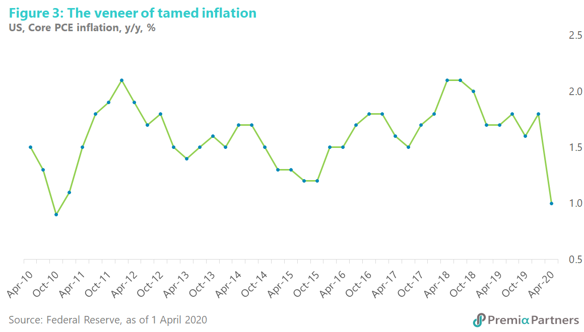
GDP growth averaged a lackluster 2.3 per cent in the decade from 2010 to 2019, and the Fed’s preferred inflation measure, the Core Personal Consumption Expenditure (PCE) inflation rate, was capped at around 2.1 per cent since the Global Financial Crisis (figure 3).
The middling GDP growth rates and the range-bound core PCE inflation rates may have obscured an alternative view of prices – an almost stealthy inflationary ascent over recent years.
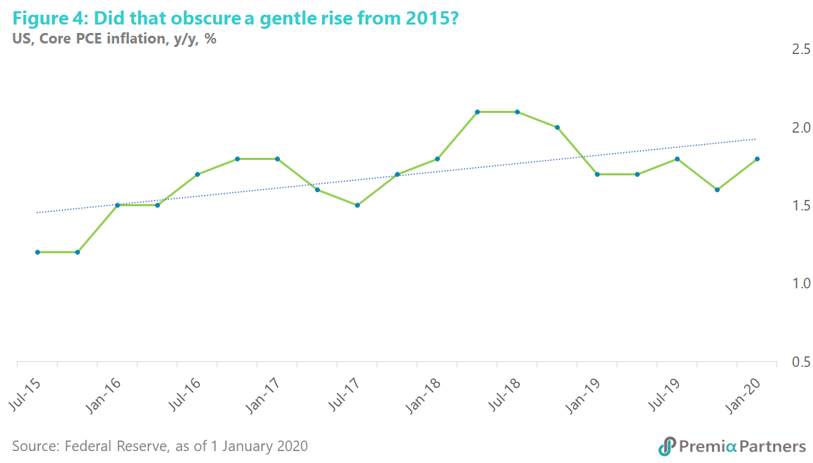
The pandemic may have interrupted inflationary forces gathering pace from 2H2015. Stripping out the sudden shock of COVID-19 on prices, core PCE has been on an uptrend from mid-2015 to end-2019 (figure 4).
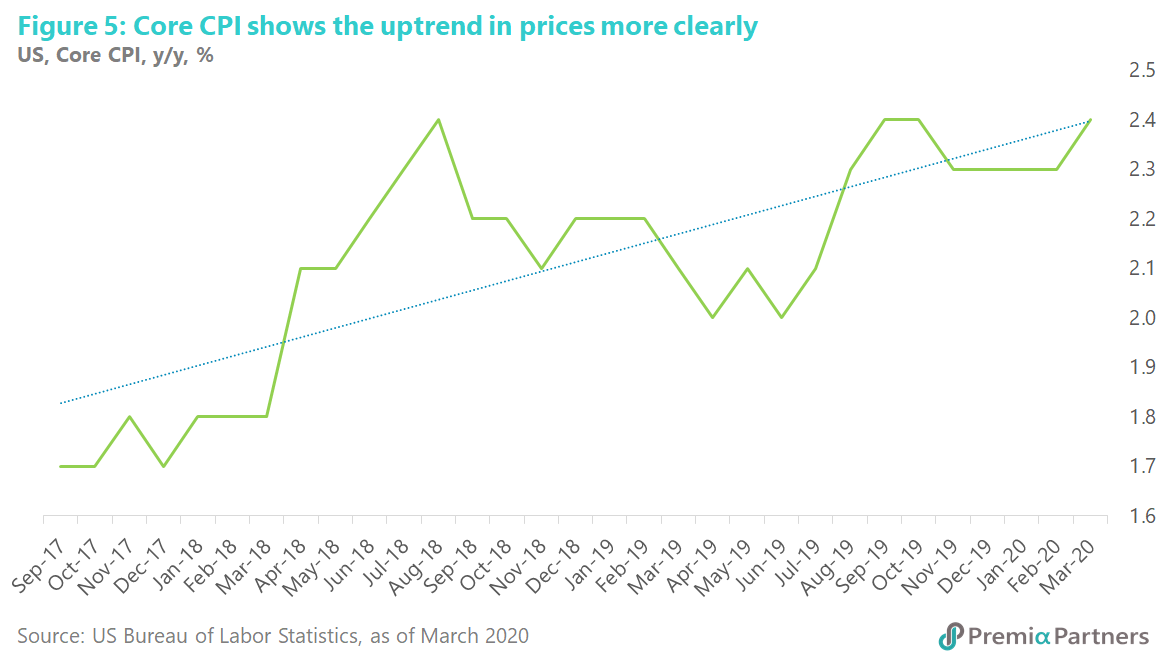
While the Fed had been focused on core PCE inflation, core CPI (consumer price index) inflation shows the uptrend in prices more clearly (figure 5).
As the Fed says, “the CPI tends to show more inflation than the PCE”. Nevertheless, leaving aside the absolute levels of inflation shown by CPI – which the Fed argues is structurally higher for the CPI in part because of its less “comprehensive coverage of goods and services” – the uptrend in prices (from 2017 in this case) shown by the CPI is more pronounced (figure 5). So, it comes down to the goods and services in the CPI versus the PCE basket.
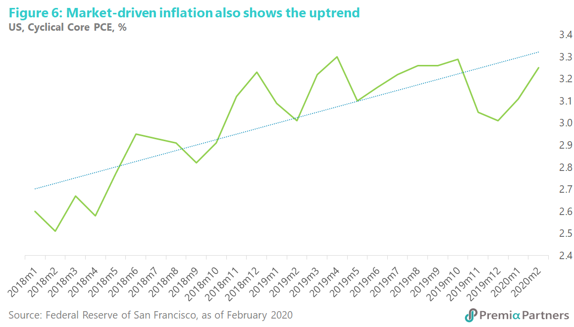
Digging a bit deeper, have a look at the San Francisco Federal Reserve’s “Cyclical Core PCE Inflation” index, which includes only items that have negative and “statistically significant” relationships to the unemployment gap. In short, it is a basket of goods and services that are driven by market forces, excluding items such as healthcare services which are affected by bureaucratically administered prices.
This Cyclical Core PCE inflation rate has been mean-reverting on a rising trendline since early 2018, until it was pushed down by the pandemic in 2Q2020 (figure 6).
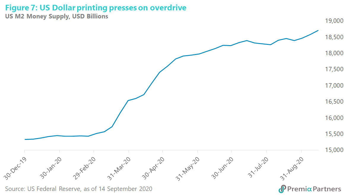
Inflation interrupted not terminated? Inflation was suddenly and severely disrupted by COVID-19. But monetary expansion has also been disruptive in the extreme – with M2 money supply up 22 per cent in less than nine months (figure 7).
In a recent Premia Partners Insight , we wrote about the long-term relationship between rates of growth in money supply, nominal GNP and inflation in the United States. A study by a former research director of the Federal Reserve Bank of St. Louis, William G. Dewald found “a close long-term fit” between M2 growth, nominal GNP growth and inflation. As we suggested, the long-game in the US is to aggressively expand money supply to devalue the Dollar and raise prices in an effort to boost nominal GDP. This is about debt sustainability – to keep US nominal economic growth ahead of interest rates to avoid drowning in debt and interest repayments. In short, US policy makers need to raise inflation to work out the country’s economic problems.
The quite stunning and coordinated efforts of the Fed and the US Treasury appear to have convinced the market they will achieve what they want. To repeat, the Fed has raised M2 by 22% in less than nine months and the US Treasury will turn a budget deficit of 4.6 per cent of GDP in 2019 to an estimated 16 per cent of GDP for 2020. This is Modern Monetary Theory abruptly transformed from academic theory to practice. The policy taboo has been broken.
For good measure – for the doubters – the Fed now says 2 per cent inflation is not the target anymore. The new target is “average 2 per cent inflation”, allowing for an overshoot of 2 per cent, to ensure inflation takes firm roots.
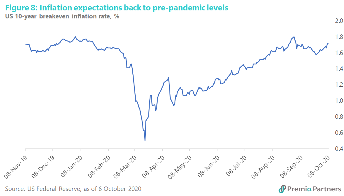
So, the 10-year breakeven inflation rate – that is, the 10-year Treasury yield minus the 10-year TIPS yield, and hence a measure of the market’s inflation expectations – has gone back to pre-pandemic levels. Last month, it hit December 2019 levels. It pulled back a bit but is now rising again (figure 8).
The bi-partisan US Election spending splurge. The media has already coined the phrase “Bidenomics” for what some commentators have likened to a new, “New Deal”. The figures totaling up Joe Biden’s spending proposals vary considerable between analysts. According to the US public policy organisation “Committee for a Responsible Federal Budget”, Joe Biden’s proposals total USD 10.35 trillion. Deducting savings and additional taxes, the net fiscal boost totals USD 5.3 trillion. The Committee’s central estimate is that a President Biden would add another USD 5.6 trillion (after interest costs) to the US deficit over 10 years from 2021-2030. For context, the US GDP will this year likely be worth USD 20 trillion.
Mind you, even if the November 3 election goes to Donald Trump, the difference in the deficit numbers are not likely to matter much to inflation expectations. The Committee estimates Trump’s spending and tax cut proposals total USD 4.85 trillion. Net of savings (spending cuts), the Trump agenda offers a net fiscal boost of USD 4.7 trillion, and (after accounting for interest costs) adds another USD 4.95 trillion to the US deficit over 10 years.
All of these suggest a huge amount of US Treasuries will have to be issued for years to come, raising the question of where demand will come from at these bottom of the cycle yields?
US yield curve steepening as a pandemic “recovery trade”. In another recent Premia Partners insight , we wrote about the “recovery trade” for stocks. Just as laggard stocks will rise when we approach a vaccine, bond yields will also rise at the long end of the curve. With the Fed doggedly anchoring the short-end of the curve through its zero-rate policy, yield curve steepening would appear unavoidable.
Watch the copper futures to gold ratio. It tends to track the 10-year US Treasury yield. That ratio has been rising from its April low, and that corresponds to the rise in the 10-year US Treasury yield over the same period (figure 9). That’s another manifestation of the ‘recovery trade”.
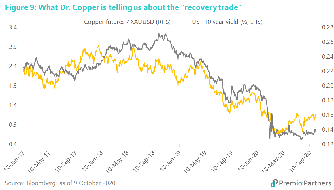
Of course, a major setback in the search for a vaccine could push copper and the yield spread between the 10-year and 2-year US Treasury back down again. Yet, with the spread now still only around 50-60 basis points above zero, the risks are very much skewed to the upside.
The 10-year breakeven inflation rate is now at around 1.7 per cent. Yet the 10-year US Treasury yield is still at around 74 basis points. If this is not the bottom of the bond yield cycle, it should be pretty close. The risks of holding bonds at these levels are asymmetric relative to the yields.
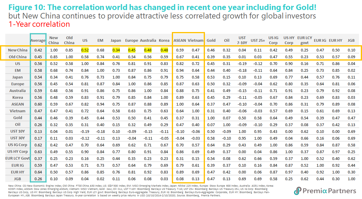
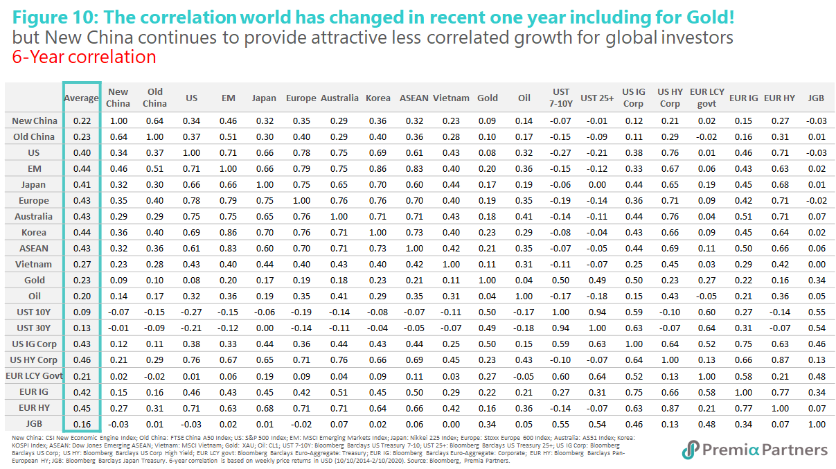
Rethinking bonds for income and diversification. The massive monetary and fiscal stimulus undertaken all over the Developed Markets – and in particular, the massive amount of asset purchases undertaken by central banks – has increased correlations between stocks and bonds.
As can be seen from the below tables, correlations have gone up across the board, with 1-year correlations considerably higher than the 6-year correlations. Note in particular how Developed Market corporate credits are now so highly correlated to DM equities (figure 10).
For example, the 1-year correlation between US Investment Grade corporate credits and US stocks is now 0.7. US high yield credits now have a 0.9 correlation with US stocks. You can see the same high correlations between European corporate credits and US and European stocks. So much for diversification.
Indeed, Chinese stocks – despite the rise in 1-year correlations compared to the 6-year correlations – still offer much better diversification to DM stocks than even DM Investment Grade credits.
With yields and rates scraping the bottom of the barrel, the argument for investing in bonds for income and safety is also questionable given the duration risk. For those looking to US Treasury for safe haven trades or cash parking, the short end or floating rate treasuries may be more appropriate instead.